Romyol Garden
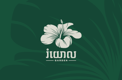
𝐑𝐨𝐦𝐲𝐨𝐥 𝐆𝐚𝐫𝐝𝐞𝐧 is a Khmer restaurant with Thai, Vietnamese, and seafood cuisine types. Located at Street 95, House 82, behind PTT Gas Station, Bokor Stop, Sangkat Boeung Keng Kang III. As you already know, 𝐊𝐛𝐞𝐮𝐧𝐠 𝐂𝐫𝐞𝐚𝐭𝐢𝐯𝐞 𝐒𝐭𝐮𝐝𝐢𝐨 provides clients a wide range of services such as designing and visual brand identity. At the same time, […]
Must Travel

Travel agency that offers luxury accommodations and travel services. The M logo is designed from a heart shape cut out on top to look like a bird’s wing flying above the sky, and finally, we removed it to match the letter M which is the name of Must Travel. Purpose orange indicates the power for flying […]
OneSala
OneSala is an online learning and teaching platform for those who want to do self-study and increase their knowledge everywhere through the Internet or other electronic devices such as smartphones and computers. Also, those who have the knowledge and teachers who want to share knowledge can join the OneSala app to earn more money and […]
CREATE SPACE DESIGN STUDIO
In 2021, we had a chance to reconfigure the Create SPACE Design & Construction brand identity. The first thing we did was to rework the iconic “geometry” symbol, with our respect to their brand value and culture. We redesign with a modern minimalist and creative negative space of the letter “C”. This logo plays off […]
BOU NGAN Wedding Planner

The identity for Bou Ngan which is a wedding planner in Siem Reap. For creating this identity we focused on Khmer culture and style and also included some special features to make the logo more beautiful and luxurious. We have chosen the letter “ង” as a logo that matches the name of the business (បួង៉ាន់) […]
Phum Morodork
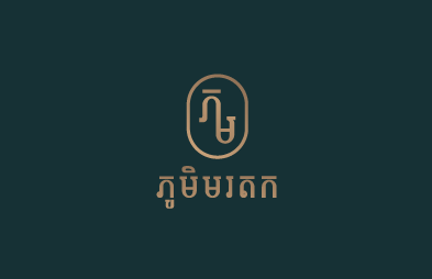
Kbeung has completed a project creating a brand identity for Phum Morodork. Phum Morodork is a real estate company in Svay Rieng, and they will establish their branches in other provinces. For this identity, we focus on the nature and luxury of real estate projects and the abundance of people who […]
Central Badminton

Soul Coffee House

Soul Coffee House is launched on 28th March 2022. With many delicious signature drinks and desserts, Soul Coffee House provides you with the euphoria and pleasant feelings that people often associate with their first cup of coffee in the morning. Kbeung Creative Studio has developed a new brand identity for Soul Coffee House. The design […]
CamWEN (Cambodia Women Entrepreneur)
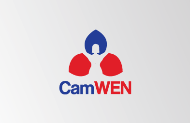
Camwen is an NGO for the Cambodian Women Entrepreneurs Network. In designing this logo, we created colors representing the Khmer nation and Rumduol leaves with female symbols as well.
Phum Pong Tea

We designed the mark for the Phum Pong Tea Khmer using an eggshell color in a circle shape of a duck egg and then used green to draw a duck into a circle, so we got good Pictorial marks or symbols logo. Therefore, Phum Pong Tea Khmer provided a logo that can attract customers, make […]